Charts
Insight supports basic charts. They are easy to configure and give you a visual representation of your data.
Opening an Insight chart
There are several ways to display charts. You can use the menu action "chart":
{
    "action": "chart",
    "label": "Chart",
    "icon": "icon-barcode",
    "actionValues": [
        {
            "chart": {
                "tree": "my-tree"
            }
        }
    ]
}
"tree" defines which Insight tree should be visualized as an Insight chart. In this case all roots of the target tree are loaded and rendered as a chart.
You can also configure charts to show up within the regular Insight details view. The behaviour is similar to Insight Tables. This means that if you have a node "a" which has a childNode "b" with appropriate chart config attached, if you open the detail view of "a" open, it will show all elements of "b" as a chart inside the Insight details view.
Configuration of a chart
To help Insight understand which nodes of a tree configuration should be visualized as a chart, mark them.
{
    "name": "my-example-node",
    "title": "Examples",
    "label": "${myLabelAttribute}",
    "icon": "icon-site-map",
    "color": "${myColorAttribute}",
    "chart": {
        "label": "${myLabelAttribute}",
        "value": "${amount}",
        "group": "${amountType}"
    }
}
If you don't use the group setting, all nodes will be interpreted as one dataset. If you want to have different datasets, divide them by using the group attribute. Please note that each bar can have a different color, if you want to, as every node can have it's own color setting.
Types
Insight supports various types of charts.
bar
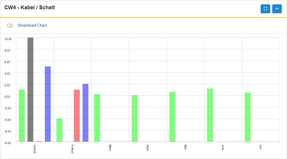
A bar-Chart is the most basic chart type that visualizes data as bars. Is is the default type of chart. You can use a bar-chart in a 1:1 usecase where every single record for the chart carries one data point as well as in 1:n usecases where every single record for the chart carries several data points.
For the 1:1 usecase use the following notation:
{
    "name": "my-example-node",
    "title": "Examples",
    "label": "${myLabelAttribute}",
    "icon": "icon-site-map",
    "color": "${myColorAttribute}",
    "chart": {
        "label": "${myLabelAttribute}",
        "value": "${amount}"
    }
}
For the 1:n usecase use the following notation:
{
    "name": "my-example-node",
    "title": "Examples",
    "label": "${myLabelAttribute}",
    "icon": "icon-site-map",
    "color": "${myColorAttribute}",
    "chart": {
        "label": "${myLabelAttribute}",
        "values": [
            {
                "label": "labelA",
                "value": "${valueA}",
                "color": "#FF0000"
            },
            {
                "label": "labelB",
                "value": "${valueB}",
                "color": "#00FF00"
            }
        ]
    }
}
Please note that the chart.label for the 1:n usecase should be unique as it is the one being rendered on the x-axis. Additionally, the labels for each value in the 1:n usecase need to be fix, as they will be rendered in the legend. Please note that bar-charts for 1:1 usecases support the "group" feature, while bar-charts for 1:n usecases do not.
line
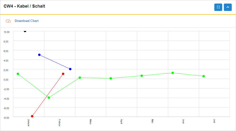
A line-Chart is another basic chart type that visualizes data as lines. Is is not the default type of chart. Similar to bar-charts you can use it in 1:1 usecases as well as 1:n usecases.
For the 1:1 usecase use the following notation:
{
    "name": "my-example-node",
    "title": "Examples",
    "label": "${myLabelAttribute}",
    "icon": "icon-site-map",
    "color": "${myColorAttribute}",
    "chart": {
        "label": "${myLabelAttribute}",
        "value": "${amount}",
        "type": "line"
    }
}
For the 1:n usecase use the following notation:
{
    "name": "my-example-node",
    "title": "Examples",
    "label": "${myLabelAttribute}",
    "icon": "icon-site-map",
    "color": "${myColorAttribute}",
    "chart": {
        "label": "${myLabelAttribute}",,
        "type": "line"
        "values": [
            {
                "label": "labelA",
                "value": "${valueA}",
                "color": "#FF0000"
            },
            {
                "label": "labelB",
                "value": "${valueB}",
                "color": "#00FF00"
            }
        ]
    }
}
Please note that the chart.label for the 1:n usecase should be unique as it is the one being rendered on the x-axis. Additionally, the labels for each value in the 1:n usecase need to be fix, as they will be rendered in the legend. Please note that line-charts for 1:1 usecases support the "group" feature, while line-charts for 1:n usecases do not.
radar
A radar-Chart is another basic chart type. Is is not the default type of chart. Similar to bar-charts you can use it in 1:1 usecases as well as 1:n usecases.
For the 1:1 usecase use the following notation:
{
    "name": "my-example-node",
    "title": "Examples",
    "label": "${myLabelAttribute}",
    "icon": "icon-site-map",
    "color": "${myColorAttribute}",
    "chart": {
        "label": "${myLabelAttribute}",
        "value": "${amount}",
        "type": "radar"
    }
}
For the 1:n usecase use the following notation:
{
    "name": "my-example-node",
    "title": "Examples",
    "label": "${myLabelAttribute}",
    "icon": "icon-site-map",
    "color": "${myColorAttribute}",
    "chart": {
        "label": "${myLabelAttribute}",,
        "type": "radar"
        "values": [
            {
                "label": "labelA",
                "value": "${valueA}",
                "color": "#FF0000"
            },
            {
                "label": "labelB",
                "value": "${valueB}",
                "color": "#00FF00"
            }
        ]
    }
}
Please note that the chart.label for the 1:n usecase should be unique as it is the one being rendered on the outline. Additionally, the labels for each value in the 1:n usecase need to be fix, as they will be rendered in the legend. Please note that radar-charts for 1:1 usecases support the "group" feature, while radar-charts for 1:n usecases do not.
pie
TODO
bar-stacked-values
TODO
bar-stacked-groups
TODO
bubble
A bubble-Chart is a basic chart type that can visualize three different dimensions of data: The x-axis, y-axis and magnitude. Similar to bar-charts you can use it in 1:1 usecases as well as 1:n usecases.
For the 1:1 usecase use the following notation:
{
    "name": "my-example-node",
    "title": "Examples",
    "label": "${myLabelAttribute}",
    "icon": "icon-site-map",
    "color": "${myColorAttribute}",
    "chart": {
        "label": "${myLabelAttribute}",
        "value": "${amount}",
        "magnitude": "${myMagnitudeAttr}",
        "type": "bubble"
    }
}
For the 1:n usecase use the following notation:
{
    "name": "my-example-node",
    "title": "Examples",
    "label": "${myLabelAttribute}",
    "icon": "icon-site-map",
    "color": "${myColorAttribute}",
    "chart": {
        "label": "${myLabelAttribute}",,
        "type": "bubble"
        "values": [
            {
                "label": "labelA",
                "value": "${valueA}",
                "magnitude": "${magnitudeA}",
                "color": "#FF0000"
            },
            {
                "label": "labelB",
                "value": "${valueB}",
                "magnitude": "${magnitudeB}",
                "color": "#00FF00"
            }
        ]
    }
}
Please note that the chart.label for the 1:n usecase should be unique as it is the one being rendered on the x-axis. Additionally, the labels for each value in the 1:n usecase need to be fix, as they will be rendered in the legend. Please note that bubble-charts for 1:1 usecases support the "group" feature, while line-charts for 1:n usecases do not.
Layout
Currently supported types of Insight charts:
- "bar": A regular barchart.
- "line": A regular linechart.
- "pie": A regular piechart.
- "bar-stacked-groups": A bar-chart, vertically stacking different groups at the same label on top of each other.
- "bar-stacked-values": A bar-chart, vertically stacking different values of the same record at the same label on top of each other.
Please note that the type "bar-stacked-values" requires the following notation:
{
    "name": "my-example-node",
    "title": "Examples",
    "label": "${myLabelAttribute}",
    "icon": "icon-site-map",
    "color": "${myColorAttribute}",
    "chart": {
        "label": "${myLabelAttribute}",
        "values": [
            { "value": "${s1}", "color": "#ff0000", "label": "s1" },
            { "value": "${s2}", "color": "#00ff00", "label": "s2" },
            { "value": "${s3}", "color": "#0000ff", "label": "s3" },
            { "value": "${s4}", "color": "#f0f0f0", "label": "s4" },
            { "value": "${s5}", "color": "#0f0f0f", "label": "s5" },
            { "value": "${s6}", "color": "#a0a0a0", "label": "s6" },
            { "value": "${s7}", "color": "#b0b0b0", "label": "s7" },
            { "value": "${s8}", "color": "#c0c0c0", "label": "s8" },
            { "value": "${s9}", "color": "#d0d0d0", "label": "s9" },
            { "value": "${s10}", "color": "#e0e0e0", "label": "s10" },
            { "value": "${s11}", "color": "#333333", "label": "s11" },
            { "value": "${s12}", "color": "#444444", "label": "s12" },
            { "value": "${s13}", "color": "#555555", "label": "s13" },
            { "value": "${s14}", "color": "#666666", "label": "s14" },
            { "value": "${s15}", "color": "#777777", "label": "s15" },
            { "value": "${s16}", "color": "#888888", "label": "s16" },
            { "value": "${s17}", "color": "#999999", "label": "s17" },
            { "value": "${s18}", "color": "#330033", "label": "s18" },
            { "value": "${s19}", "color": "#003300", "label": "s19" },
            { "value": "${s20}", "color": "#000033", "label": "s20" },
            { "value": "${s21}", "color": "#330000", "label": "s1" },
            { "value": "${s22}", "color": "#990000", "label": "s22" },
            { "value": "${s23}", "color": "#009900", "label": "s23" },
            { "value": "${s24}", "color": "#000099", "label": "s24" },
            { "value": "${s25}", "color": "#990099", "label": "s25" },
            { "value": "${s26}", "color": "#660000", "label": "s26" },
            { "value": "${s27}", "color": "#006600", "label": "s27" }
          ],
        "group": "${amountType}",
        "type": "bar-stacked-values"
    }
}
The chart "bar-stacked-values" supports the "group" feature while "bar-stacked-groups" does not.
Legend
By default, a legend will be rendered. You can disable the legend or change it's width, borderColor and backgroundColor with the following notation:
{
    "name": "my-example-node",
    "title": "Examples",
    "label": "${myLabelAttribute}",
    "icon": "icon-site-map",
    "color": "${myColorAttribute}",
    "chart": {
        "label": "${myLabelAttribute}",
        "value": "${amount}",
        "group": "${amountType}",
        "type": "line",
        "legend": {
            "hidden": true,
            "width": 200,
            "borderColor": "red",
            "backgroundColor": "white"
        }
    }
}
You can also define the position of the legend. Allowed values are "top", "bottom" and "hover". Default: "hover". "top" and "bottom" legends are fixed in position and not collapseable. For fixed legends, you can change their height as well.
{
    "name": "my-example-node",
    "title": "Examples",
    "label": "${myLabelAttribute}",
    "icon": "icon-site-map",
    "color": "${myColorAttribute}",
    "chart": {
        "label": "${myLabelAttribute}",
        "value": "${amount}",
        "group": "${amountType}",
        "type": "line",
        "legend": {
            "position": "top",
            "height": 200
        }
    }
}
Scale
By default, Insight Charts will create a scale from the chart's minimum value up to the chart's maximum value and split the chart into ten vertical segments. You can alter the scale's behaviour in many ways:
If you want to set a different step size, instead of the default ten steps from the chart's minimum value to the chart's maxmium value, use the following notation:
{
    "name": "my-example-node",
    "title": "Examples",
    "label": "${myLabelAttribute}",
    "icon": "icon-site-map",
    "color": "${myColorAttribute}",
    "chart": {
        "label": "${myLabelAttribute}",
        "value": "${amount}",
        "scale": {
            "value": 5
        }
    }
}
If you want to set a different start of the scale, instead of the actual data based one, use the following notation:
{
    "name": "my-example-node",
    "title": "Examples",
    "label": "${myLabelAttribute}",
    "icon": "icon-site-map",
    "color": "${myColorAttribute}",
    "chart": {
        "label": "${myLabelAttribute}",
        "value": "${amount}",
        "scale": {
            "start": -10
        }
    }
}
If you want to set a different end of the scale, instead of the actual data based one, use the following notation:
{
    "name": "my-example-node",
    "title": "Examples",
    "label": "${myLabelAttribute}",
    "icon": "icon-site-map",
    "color": "${myColorAttribute}",
    "chart": {
        "label": "${myLabelAttribute}",
        "value": "${amount}",
        "scale": {
            "end": 100
        }
    }
}
If you want to set a different width of the scale, use the following notation:
{
    "name": "my-example-node",
    "title": "Examples",
    "label": "${myLabelAttribute}",
    "icon": "icon-site-map",
    "color": "${myColorAttribute}",
    "chart": {
        "label": "${myLabelAttribute}",
        "value": "${amount}",
        "scale": {
            "width": 100
        }
    }
}
If you want to set the number of decimal places used for rounding scale values, use the following notation:
{
    "name": "my-example-node",
    "title": "Examples",
    "label": "${myLabelAttribute}",
    "icon": "icon-site-map",
    "color": "${myColorAttribute}",
    "chart": {
        "label": "${myLabelAttribute}",
        "value": "${amount}",
        "scale": {
            "decimalPlaces": 0
        }
    }
}
If you want to set the number of vertical segments used to display between the chart's min value and chart's max value, instead of the default ten segments, use the following notation:
{
    "name": "my-example-node",
    "title": "Examples",
    "label": "${myLabelAttribute}",
    "icon": "icon-site-map",
    "color": "${myColorAttribute}",
    "chart": {
        "label": "${myLabelAttribute}",
        "value": "${amount}",
        "rowAmount": 5
    }
}
By default the scale does go up the maximum value found in data, to the end value specified via config, or to the maximum highlight line. If you do not want to display highlight lines outside of the original data range, use the following notation:
{
    "name": "my-example-node",
    "title": "Examples",
    "label": "${myLabelAttribute}",
    "icon": "icon-site-map",
    "color": "${myColorAttribute}",
    "chart": {
        "label": "${myLabelAttribute}",
        "value": "${amount}",
        "includesHighlights": false
    }
}
Highlights
You can configure custom highlight lines in Insight Charts to visualize and emphasize important thresholds. Use the following notation:
{
    "name": "my-example-node",
    "title": "Examples",
    "label": "${myLabelAttribute}",
    "icon": "icon-site-map",
    "color": "${myColorAttribute}",
    "chart": {
        "label": "${myLabelAttribute}",
        "value": "${amount}",
        "highlights": [
            {
              "value": 8,
              "color": "#ff0000",
              "label": "Threshold #1"
            }
        ]
    }
}
You can also set different line styles for the highlight lines. Possible options: "line", "dashed", "dotted". Default: "line".
{
    "name": "my-example-node",
    "title": "Examples",
    "label": "${myLabelAttribute}",
    "icon": "icon-site-map",
    "color": "${myColorAttribute}",
    "chart": {
        "label": "${myLabelAttribute}",
        "value": "${amount}",
        "highlights": [
            {
              "value": 8,
              "color": "#ff0000",
              "label": "Threshold #1",
              "lineStyle": "dotted"
            }
        ]
    }
}
Highlights are supported in all chart types except pie-charts.
Filters
TODO
Rendering options
You can adapt the way Insight renders charts by changing basic layout settings.
- textSize: Changes the text size of labels
- pointSize: Changes the size of bars / lines
- padding: Changes the space between bars / lines
- xAxis: The height of the xAxis label section
- rowHeight: Changes the height of a row
- radius: Changes the size of pie charts
- markerRadius: Changes the size of markers
- gridColor: Changes the color of the background grid lines
- sticky: Defines if the y-Axis scale should be sticky or not, default true
Example:
{
    "name": "my-example-node",
    "title": "Examples",
    "label": "${myLabelAttribute}",
    "icon": "icon-site-map",
    "color": "${myColorAttribute}",
    "chart": {
        "label": "${myLabelAttribute}",
        "value": "${amount}",
        "textSize": 14,
        "pointSize": 2,
        "padding": 1,
        "xAxis": 100,
        "rowHeight": 10,
        "radius": 200,
        "gridColor": "#ff0000",
        "sticky": false
    }
}
Miscellaneous
You can disable the "Download PNG" Button, if you don't want your users to use it. Default: true. Example:
```js { "name": "my-example-node", "title": "Examples", "label": "${myLabelAttribute}", "icon": "icon-site-map", "color": "${myColorAttribute}", "chart": { "label": "${myLabelAttribute}", "value": "${amount}", "downloadPng": false } }